
Weather | Buy&Sell | Forums |  |
Weather | Buy & Sell | Gallery | Forums | |
Hey!
Thanks for all your comments so far, fixed plenty of bugs, and new look working on many many platforms.
If you have any final say, now's your chance.
And remember - if you want the old "wider" layout, it's available at the bottom of the screen via the "Widescreen | Fixed" layout .. ![]()
Check it out at:
www.seabreeze.com.au/forums/
Click the thumbs on this topic to vote for 'go live' on Monday... ![]()
Awesome. Looks great with the widescreen mode.
It looks good on the mobile when I don't have "fit to screen" setting active. But i usually have it on because it works well with other websites. Would be cool if that can be fixed. Apart from that its really good.
Looks good Laurie.
I found the ocean backgraound a bit disorientating whe first navigating/scrolling the pages but it's definately an improvement. ![]()
![]()
looks great ![]()
if you are planning to put ads and banners on that lovely new free space full of water, that probably won't look so hot![]()
why change it??
did it not work before??
seems the same, can a guide to new features be attached??
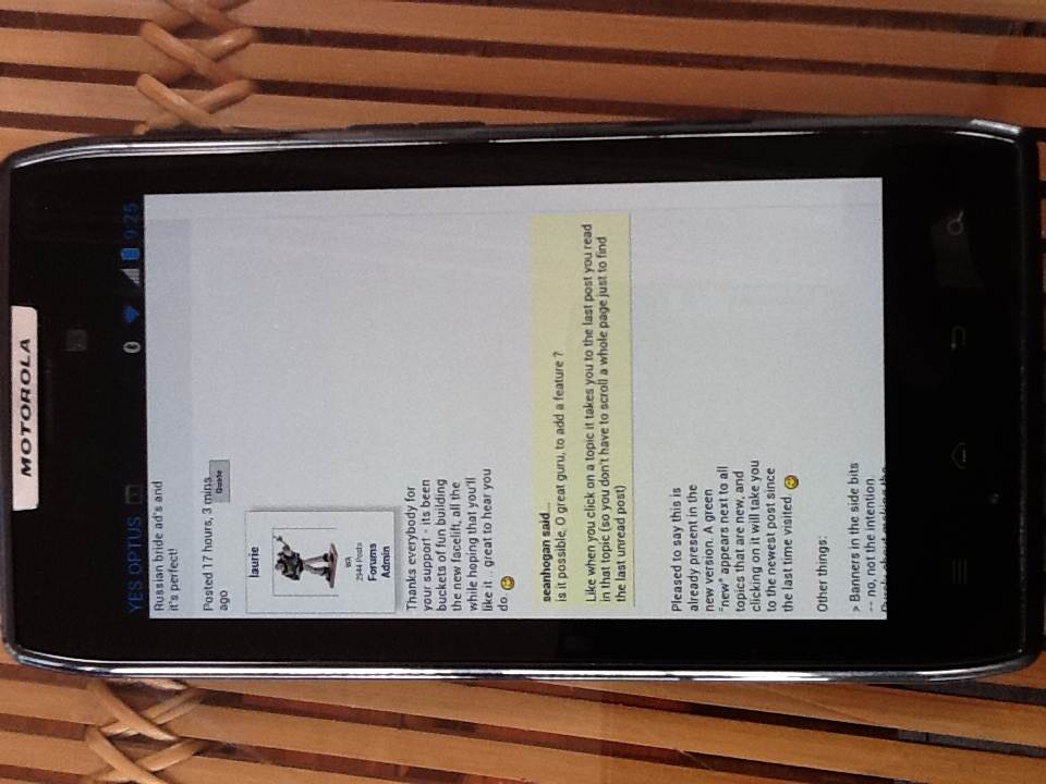
is it possible, O great guru, to add a feature ?
Like when you click on a topic it takes you to the last post you read in that topic (so you don't have to scroll a whole page just to find the last unread post)
Thanks everybody for your support - its been buckets of fun building the new facelift, all the while hoping that you'll like it .. great to hear you do. ![]()
All looks great !!!
One last comment / feedback , ..... I've just realized that I never look at the bottom of the page .
May mean nothing , don't know ? .........
Hang on ,, this is really my last comment feedback !
I thought we had got rid of all the crap on the right hand side of the page .
But alas no !!!,
looks really good
are you planning on introducing any social media integration? a lot of the newer forums have this.
Al
Do we have thumbs in the Android version yet? I'm on a minesite without coverage or wifi at the moment. I keep meaning to ask via my mobile, but it's too hard to type on it. Not the page's fault, HTC One V is really way too small for my fat fingers. It does weird stuff too (in general), I might try the Android version of Firefox next time I'm in range of an internet...
Much easier to read laurie, well done. It has always been a much easier forum to use than say kite forum and it has just got better. Haven't tried it on my iPhone yet will do tomoz. Well done mate.
Ps any chance you can take the red thumb thing off, I think there are some rebel riders stalking me.
Lol......
More (.(.)
...actually. How about this for a feature?
- A Not Safe For Work flag that *anybody* could click nest to a post.
- An 'I am at work' checkbox or whatever up top of forum pages.
If both = Y then do not display images for that particular post.
Next time?
I think it looks good Laurie. Well done. Do you think you could make it easier to loads multiple pics - instead of having to load one at a time it would be nice if you could just highlight multiple shots with shift / control / command and then upload all at once.
Hi Laurie,
On Android 4.0.4 the text is being pushed to the left unless it is in a quote box.
Also for both old and new versions of the site when using iPad 2 and
Reply to topic
Add an image to my message
I can't get Select to work
Cheers, P
^Same happens of my phone. Galaxy S3.
If you turn off the 'fit webpage to screen' setting (or soimething along those lines) it fixes it. But then all other websites look worse.
Just added:
> Thumbs now available on mobile
> 'new' indicator in the cateogries
Questions:
>> you could make it easier to loads multiple pics
Yes! It's already been added to the Buy & Sell, and yes, intention is to add here, as it's a pain picking images one by one.
Other ideas (thumbs/worksafe) added to the wishlist. Good ideas - cheers!
Regards the Galaxy S3 .. I've been testing via a Galaxy S2, and have tried the Android 'Auto-fit pages [ x ]' option in the browser to both on & off settings, and doesn't make any difference at all.
Just tweaked a few things.. how is it now, any S3 browsers having trouble?
Thanks... ![]()


