
Weather | Buy&Sell | Forums |  |
Weather | Buy & Sell | Gallery | Forums | |
Yeh I'm having the same thing as paddymac. Looks perfect with the auto-fit off. But all crammed on the left when it is on. Are there any recommended internet apps for android. Will try one of those and see if it is different.
Edit: Just downloaded chrome and firefox for android. And they both work fine. They don't even seem to have that particular setting. And they seem to work faster than the default internet app that comes installed on the phone. Problem solved for me!
oky doky - looks like we'll need to get our hands on an S3 or Razr to sort this "feature" out..
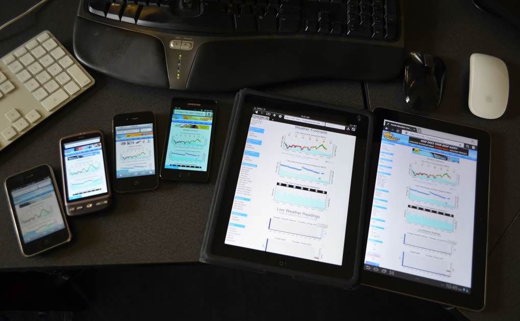
Here's our collection so, not forgetting 4 brands of browser on both PC & Mac! ![]()
^^^^
well you do have to check all products AND how good they work don't you ..... toyaholic you are Laurence ![]()
Good to see thumbs are back on android, now I can give Eppo some greens to try balance the reds.![]()
I've also found the squashy thing going on, and found that if you double tap the open space the posts unsquash. But yeah, about to download Firefox just now anyway.... ![]()
In every organisation, company or group there is some simpleton that thinks that
change is a panacea.
100 times better! ![]()
edit: 'To last post' in a thread doesn't work in Firefox, and 'Last Post' from the index page doesn't work in either FF or the Android browser.
Still the awesome though. ![]()
Skipped Chrome, as I choose FF over Chrome on pc, but am now on via Opera Mobile, which not only comes with its own pseudo 'last post' button (skips straight to bottom of a page) but typing in landscape mode is the best of the three.
Whether change is good, bad, required or a panacea, it is inevitable. I, for one, am always keen to see what's around the next corner. If the software I use in my job hadn't changed since I started I would have had to have gotten a new job years ago.
So I'm going to stick with Opera for now, seems to be the best solution for my situation (stupid small screen - work issue phone ![]() )
)
Thanks Laurie, it looks good nice and fresh, but can you get green arrows more often!!! kidding of course, good work mate.![]()
Hey Laurie, looks good, only improvement I can see would be to reduce the size of the Author box so that the minimum entry height is smaller. With the shadow effect it reduces the number of entries I can see on the screen by 1/3.
There are lots of entries in forums of one or two lines, so this is going to make for lots more scrolling.
I'm looking at this on an iPad, so recognise that it may look better for a smartphone.
Hi,
Buy & sell,
When you update an existing advert. Can it be saved and moved back to the top of the list. This feature was available for a long time but now it has changed again. Wg
Hen you edit your advert it stays in the same place Whitch could be lots of pages down.
For those of us who regularly update our adverts this would help heaps.
Cheers
What a fantastic improvement.
Now can we get rid of the yellow box at the top.
It makes me think I've got some nasty pm from someone that I don't want to read?
Hey Laurie,
I'm on a 30" screen with 2560x1600 resolution.
The background image is to small for that and the header/menu bar stops about 3/4 to the right of the screen.
Size does matter![]()
Besides that, all good.
Looks good except my little opinion is that there's still too much white, it kinda hurts the eyes. Just the white clouds around the bottom of the water pics in normal view - why not just leave the water?
Looks great on my Motorola now! Much easier to navigate & view.![]()
A couple of (minor) criticisms;
Why not push the format a little more? Apart from font & colour changes (re; background ocean scenery & pastels) I haven't noticed a huge change on my pc - although I didn't have an issue with the old format. Just saying - if you're going to change something, do you change it a bit, or a lot...I guess the 'mother' drink is an example of not changing too much?
Also, when I right click to view the last topic in a thread that contains a pic (say funny images thread) I don't get the 'open in new tab' option, just the image options (W7 OS) - please fix as I like to start by opening a gazillion tabs & work my way through them over the course of the next few hours.![]()
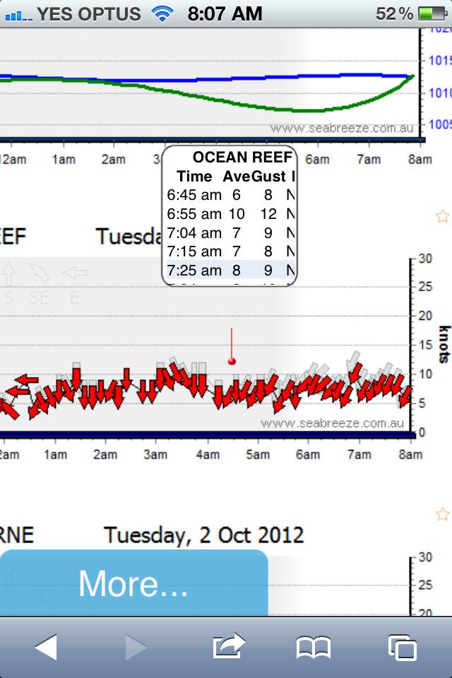
Laurie - formatting on the iPhone needs some tweaking. See picture attached. Wind reading relevant to arrows are not correctly aligned and it does not display all content.
IE9 - holding cursor over arrow does not display wind readings, may only be my browser as it works on Firefox browser.
Hey Laurie, there is a small problem with the search function in the Buy&Sell section.
Search Criteria
Category: Kitesurfing - Boards
Make: Slingshot (or any other make)
Result
No Items Found


