Forums > Windsurfing General

Forums Facelift...

Reply
Created by laurie > 9 months ago, 24 Sep 2012
mineral1
WA, 4564 posts
26 Sep 2012 4:52PM
Thumbs Up

laurie said...

mineral1 said...
Just a thought. Bold the tab fonts on the top bar, change them to maybe black.
Still fuzzy too much light colour.


Sorry, not understanding .. which tab fonts on which top bar, and are you using desktop/mobile?


graphs maps cameras......
And desktop. wide screen mode

ikw777
QLD, 2995 posts
26 Sep 2012 7:01PM
Thumbs Up

The view from my Galaxy tablet. Menu bar cut off.

Aussiex
QLD, 261 posts
26 Sep 2012 7:46PM
Thumbs Up

laurie said...
FINMEISTER said...
Looks cheap, like it's been done from one of those free template websites, much prefer the current style.
But we'll all get used to it and then it won't really matter if we like it or not.


Interesting perspective! Thanks for sharing.

Check it out now... made more tweaks to the colours, and (for those with wide screens), now has a theme image for each forum...

www.seabreeze.com.au/forums/


I like the themes, looks Awesome and IMHO eliminates the blinding white light effect

Windxtasy
WA, 4014 posts
28 Sep 2012 3:27PM
Thumbs Up

laurie said...

Windxtasy said...
This is being picky, but the pixellated font on the menu bars is very 1980's (dot matrix printer)

Still looks pale.

Good to see you're moving with the times. It is hard to keep pace with technology.

Don't worry, I love seabreeze and I'll still use it as long as it's readable and doesn't take forever to load.


Thanks. It shouldn't be pixellated .. don't know if you know how .. can you upload a screen grab (don't worry if you don't know how) ? Anybody else got this effect?


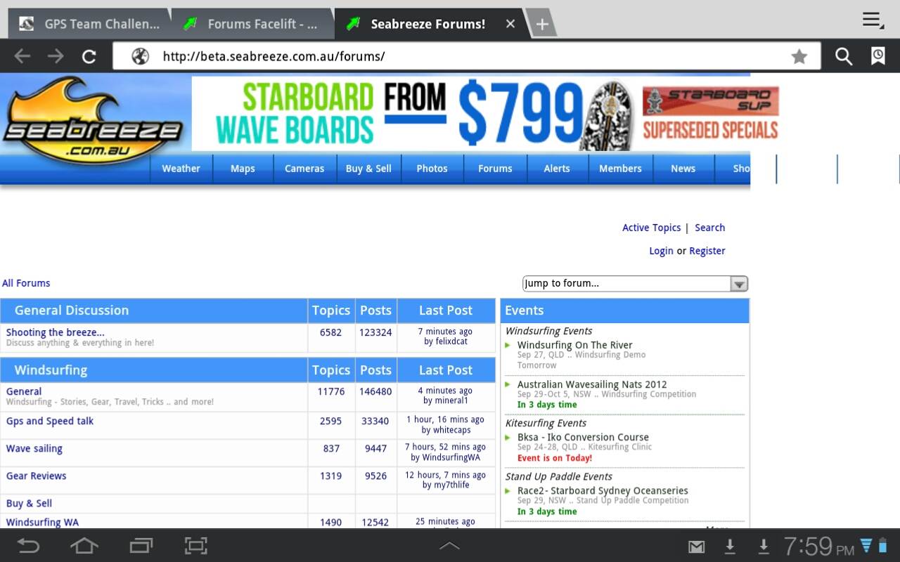
The resolution on the screenshot almost masks the pixellation but you should get the idea:


Internet explorer, 42cm computer screen


Subscribe
Reply

Forums > Windsurfing General


"Forums Facelift..." started by laurie