|
How
to read the Wind graphs
-
Did you know that the arrow colours are reversible?
This site was originally built for Windsurfers & Kitesurfers - where strong wind is a good
thing, so
green
=strong wind.
If you boat, fish or surf, then light wind is a good thing, so ..
red
=strong wind.
To reverse the colours in the graphs,
click here
-
How to work out the Wind Speed
The most recent live reading is at the right hand end of the graph, and up to 12 hours history
extends towards the left - check out the time label at the bottom of each graph.
Arrows indicate the strength by their Height on the graph and the colour of the arrow:
 Green Arrows indicate Strong wind, which is 18+ knots, 30+ Km/H, Force 5 or
more.
This graph shows an 18 to 20 knot southwester around 1pm
Green Arrows indicate Strong wind, which is 18+ knots, 30+ Km/H, Force 5 or
more.
This graph shows an 18 to 20 knot southwester around 1pm
|
 Yellow Arrows indicate Moderate wind, which is 12-18 knots, 20-29 Km/H,
Force 4.
This graphs shows a 14 to 16 knot southwester around 2pm
Yellow Arrows indicate Moderate wind, which is 12-18 knots, 20-29 Km/H,
Force 4.
This graphs shows a 14 to 16 knot southwester around 2pm
|
 Red Arrows indicate Light/No wind, which is 0-12 knots, 0-19 Km/H, Force 3 or
less.
A 7 to 9 knot easterly around 8-9am
Red Arrows indicate Light/No wind, which is 0-12 knots, 0-19 Km/H, Force 3 or
less.
A 7 to 9 knot easterly around 8-9am
|
Table of wind speeds
|
Symbol
|
Term
|
Knots
|
km/h
|
Beaufort
|

|
Light
|
0 to 10 knots
|
0-19 km/h
|
Force 3 or less
|

|
Moderate
|
11 to 16 knots
|
20-29 km/h
|
Force 4
|

|
Fresh
|
17+ knots
|
30+ km/h
|
Force 5 and above
|
-
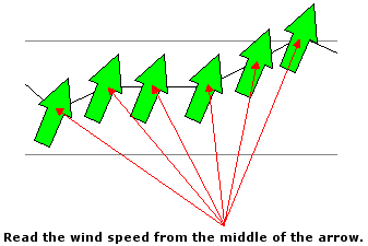
The Middle of the arrow is where you
should read the wind speed from the scale at the sides. Picture the arrow as
being like a compass needle, where it rotates around a central point of
balance.
-
The Grey arrows
indicate the maximum gust during the 10 minute period.
-
Time of day is displayed along the
bottom of the graph.
-
The site was initially designed for Windsurfers,
so the colours use a Traffic Light type colouring, which may be the opposite of
your needs .. especially if you surf! You can reverse the colours in the graphs
by
clicking here
-
For most locations, the wind strength and
direction is the result of a 10 minute average
-
How To Read The Wind Direction
 The
arrows indicate the direction the wind is going based on North being at
the top of the screen and West being at the left.
This concept confuses some people first off, because they are expecting the arrows to
work like a weather vane and point towards the arriving wind.
It can also be confusing if you're looking at your computer monitor in a Southerly direction, as all the
directions will be reversed.
We had to choose whether the arrows were indicating where wind went, or where it came from.
We figured that most things in life, such as street signs (e.g. one way signs), swell direction arrows and traffic cops all point in the direction
that something is going.
Pointing where the wind is going also makes good sense when the arrows are overlaid over a map
(..see demo)
Take a "Northerly" wind, for example. "North" is at the top of the screen (as maps generally have their
northmost point at the top), and a "Northerly" is a wind that travels from the North to the South, so it is
drawn as an arrow that points down - that is, pointing from North to
South.
Easterly Example: An easterly wind heads from the east (right side of
the screen) towards the west (left side of the screen), so the arrow is drawn
pointing to the left.
The
arrows indicate the direction the wind is going based on North being at
the top of the screen and West being at the left.
This concept confuses some people first off, because they are expecting the arrows to
work like a weather vane and point towards the arriving wind.
It can also be confusing if you're looking at your computer monitor in a Southerly direction, as all the
directions will be reversed.
We had to choose whether the arrows were indicating where wind went, or where it came from.
We figured that most things in life, such as street signs (e.g. one way signs), swell direction arrows and traffic cops all point in the direction
that something is going.
Pointing where the wind is going also makes good sense when the arrows are overlaid over a map
(..see demo)
Take a "Northerly" wind, for example. "North" is at the top of the screen (as maps generally have their
northmost point at the top), and a "Northerly" is a wind that travels from the North to the South, so it is
drawn as an arrow that points down - that is, pointing from North to
South.
Easterly Example: An easterly wind heads from the east (right side of
the screen) towards the west (left side of the screen), so the arrow is drawn
pointing to the left.
-
Sunrise & Sunset
The grey shaded area of the graphs indicate night time. The graphs are live 24 hours are day and always
display the most recent 8 hours of live wind data. You can also view yesterdays full 24 hour history by clicking
the "Yesterday" link located in the left hand menu.
The graphs below show the progress of an awesome West Australian seabreeze, and displays from Midnight to Midday
As illustrated by the grey gradient, Sunrise was at 5:32am
 In the graph above, you can see the seabreeze arriving at 10:30 am where it shifts from a SE to a SSW.
The graph below is 8pm later the same day, and shows the previous 12 hours to 8am.
The grey gradient at the left indicates night is approaching (sunset was 7:32pm)
In the graph above, you can see the seabreeze arriving at 10:30 am where it shifts from a SE to a SSW.
The graph below is 8pm later the same day, and shows the previous 12 hours to 8am.
The grey gradient at the left indicates night is approaching (sunset was 7:32pm)
 This particular day was an amazingly consistent 20 knot southwester which continued right through past midnight...interesting
change of direction from SSW to S once the sun went down...
This particular day was an amazingly consistent 20 knot southwester which continued right through past midnight...interesting
change of direction from SSW to S once the sun went down...

-
All times are aligned!

|
In the example graphs below, the wind graph at the top has readings every 10 minutes, whilst the graph underneath
every hour.
The Time axis of all the graphs on the same page always align vertically.
We've drawn the red line over the graphs to show how the times line up.
This example shows two graphs at 12:30 pm. As the lower graph only reports on the hour, there is a gap to show the time since
the last report. The upper graph has data every 10 minutes.
Stations that report hourly will have a gap at the right hand side due to the lower reporting period,
and this makes it easy to verify the latest readings.
|
The red line shows how all the graphs times align.
|