Cabrinha Gives Nod to the Old Days with 2018 Graphics
 If you've been in the kiteboarding world since the beginning, you'll find Cabrinha's graphic schemes this year oddly familiar, because they're going back to simple, clean lines. The way they used to be!
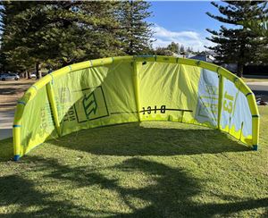
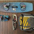
Take a good look at the Cabrinha Contra in the pic above. Those black wingtips were a trait common to all Cabrinhas around 2002-2006 thanks to their first kite - the Black Tip! The yellow canopy was one of only a few colours available to kite manufacuteres back then too. It was Yellow, Red or Blue for Cabrinha, and many others because they had to buy ripstop from factories already producing it for sailmakers. The kites were C shaped, because there was no alternative yet, and the bars were simple.
Fast forward to the vid below. The 2018 Cabrinha FX.
See those black wingtips, most of the Cabrinha line has dark colours wingtips today. The canopy? Yep, Yellow, Red or Blue in 2018. The shape? C hybrid, because everyone knows that C shaped kites perform like no other. The bar? Cabrinha are proud of their cleanest bar yet with the Fireball.
Of course the 2018 FX is far cry from the Contra pictured above. With more performance, wind range and durability - you'd be crazy to think they're the same kite. Cabrinha just went with the classic look this year - and that's cool!


