Nominated for one of the most prestigious website design awards on the internet, professional windsurfer from Australia, Sean O'Brien has launched his all-new 2014 website ready for the new season and he needs your help to vote for his site in his Awwwards.com nomination!
Australian based professional windsurfer Sean O'Brien, now in his 3rd full season on the PWA World Tour has launched his all new campaign website at www.seanobrien.com.au. The site was built by the team at Sean's Australian digital media agency, brisbne (www.brisbne.com), under Sean's creative direction. Sean has been working in digital media for over 10 years as the flexibility of the industry has accommodated the frequent travel all windsurfers do and helped with sponsorship acquisition. His new website set out to achieve more than just a fresh lick of paint, but as important research in to the future of websites for athletes in the digital age.
The 2014 website project aimed to answer a number of questions commonly asked by athletes on the web these days; is a website actually necessary? How can we increase interest and traffic to our sites?
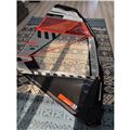
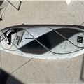
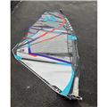
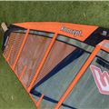
"The question I set out to answer was that in an age where most athletes use social media exclusively as their marketing and promotional tools, what relevance does a website hold in 2014? Whilst I personally don't think that a website is right for every athlete, they are still extremely relevant, as many of the details that journalists, media and sponsors want to gleam and learn about, cannot easily be showcased on social media and make it difficult to find when needed, and as we create more and more content on the web as our lives go on, it's extremely important to be in 'control' of that content. With that in mind, our focus on the site was to condense all the content, remove everything that wasn't absolutely necessary and minimise the amount of pages, whilst not trying to be another Facebook; keeping the daily updates on social media and only present the major important news. With beta testing on our analytics we kept only the 5 most viewed pages on the main menu and stripped the media gallery down to only the 30 most viewed photos as nobody wants to see thousands of image galleries. Next we incorporated a custom Google Map on the tour page to show the major destinations I travel to and list the events I will compete in so friends and family can follow me. Finally, we created the two most important pages; the Current Equipment page to show the ins and outs of the gear I'm using (which journalists love, as it saves them asking the questions) and the Sponsorship page (because we are all trying to get better sponsorships, right?). Overall I'm pretty happy with the result of the new site and so far the response on the web has been super positive. Bring on 2014!"
The website was built on Wordpress, the world's most popular content management system and features a custom theme that is totally responsive, designed to resize to fit all mobile devices and includes optimisation for Apple's high definition retina-screens.


