Select to expand quote
angryphill said..
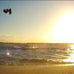
Heres a newer version of the vid
A lot better with the audio, although it feels like the pause once the voiceover stops (around 0:47) until the video restarts (0:52) is a little too long. The pause length at 1:10 seemed more natural.
Lots of words on the screen are usually just for people pausing the video, not for people casually consuming the content. Both have their place, but now that you have audio you can reduce the words to a simple phrase or single word for easy reference.
If the words are the main focus, they need to be super clear and readable. The bottom sentence at 0:57 is barely readable due to black on dark blue, compared to clearly readable text at 1:15. The positioning of the text is good though, so you might be able to try changing the text colour to white (or other high contrast colour) or put a background behind the text to make the words stand out. A 50% transparency white background should work.
I'd personally like it broken down into more steps. At 0:57 there are 4 sub-steps being displayed (veer downwind, edge hard upwind, stomp back foot, look over shoulder), but the paused picture doesn't really display any of those steps. I'd prefer simpler instructions with the pauses clearly showing that part. Don't be afraid to rewind the vid for each step to see the timing as well.
If this is going to be part of a series that starts with earlier videos, you may be able to refer to those rather than explain the same thing each time (like popping).
The more videos the better. The more variety the better. Good work so far and I hope you make more!
BTW: I'm scared ****less of landing toeside. I'll try the tip about focusing on the back foot ...