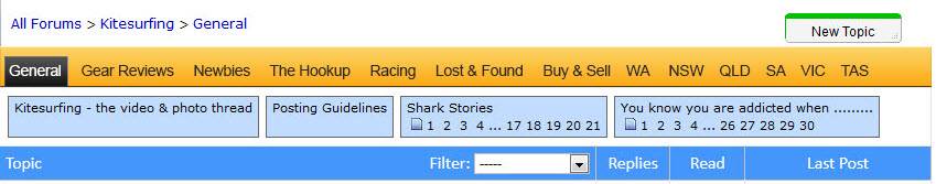
Head on over to the test site, and check the new "Easy-Nav(tm)" tab bar ...
url removed, as now installed
Post if it floats your boat, ruins your world, or anything in between... ![]()
![]()
love it! I mostly switch between general and Vic and this makes it nice and easy!
Thanks
The nav bar to jump to different forums is great.
Steady on with the super bright green though.
Keep up the good work.
how about being able to up load photos from my mobile device, or being able to see what i'm typing without having to move the cursor half way down the text box, and what ever happened to my t-shirt....?
MHO, good idea, bad implementation.
My thoughts are that it takes up extra room and makes the site look cluttered. The top is already taken up by the header, menu (which does the same thing as this new feature), stickies the content I actually want to look at I need to scroll further to view..
A good graphic designer could probably make it work, any takers?
Green and orange running rampant over the blue theme? Really? Noooooooooo. Sticks out like the proverbial dog's. Too contrasty, great for the colour blind but otherwise too strong. My 2c.
My eyes are starting to hurt,
did you let the North guys play with the colour scheme?
Can we get Laurie to add another tab like Kite forum kiteforum.com/viewtopic.php?f=1&t=2323765
529 pages of information....... and i'm only up to 297.....
I think this video sums it up
![]()
No doubt, the green is questionable.
Vote for this colour with the red/green thumbs:
Oh, and I guess there should be a chance to vote for the green. ![]() (Thumb this topic red/green) if against/in favour of the green tabbar...
(Thumb this topic red/green) if against/in favour of the green tabbar...
Laurie screen is way zoomed in now when you navigate between pages. Pretty sure this wasnt the case earlier- SGS2 using chrome....
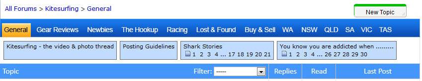
Ok .. blue it is. ![]()
Regards the Android/Chrome issue, a patch was installed that fixed the zoom for Nexus, but it broke the Galaxy S3. ![]() More tweaking to do...
More tweaking to do...
Good work, but the Tas tab is on its own. Using safari on macbook.
Maybe just get rid of the Tas tab and replace it with a tab to some sort of lesbian action pics