first salvo across the bows on the logo : www.seabreeze.com.au/forums/topic.asp?TOPIC_ID=65664&SearchTerms=a
add a kangaroo to the logo- ok
running one over? sailing the board? hanging from a key chain off the clew? flying as a sail top wind flag ala 80's?
lest see what developes in my noodle....
Anita, I am many things to many people- a repressed graphic artist, and full time desk jockey - sadly not a professional windsurfer yet (and a long way off!)
(after searching for the above link i discovered i have been upselling the Wannabees logo to a few people- cheeky bugger!![]() )
)
ok. I will give you high quality logos, with your name on it, when you email me with a real email address.
Please reach a consensus on the final design, how ever you do that in Pinnas- arm wrestle, spitting contest, lightest board owner decides, wahtever.
your choices of logo are:
Logo 1 (small personal name applied to sail top of leech)

logo 2

Logo 3

Logo 4

advice- when you get one as a sail logo have it printed onto white vinyl. Dont get it as a single colour with blank spaces for the white- the small linework will be tricky to apply neatly.
2 looks great. Thanks for your hard work, Toby.
If I can be picky?!![]()
The board looks a bit small compared to the sail.
It looks a bit like Slowboat kit and none of us are that good!![]()
Just my thoughts. Feel free to tell me to get lost![]()
Lao shi, thats perspective....artistic license and it looked funny larger.
slowboat board, nah...its my hypersonic with a 9m sail!!..
I like number 2 and number 4 (not just because it has my name on it).
If I may be picky again though, perhaps the kanga could be stylised a little more...
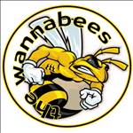
Did you design the Wannabees logo Toby?
i think it could be fashioned more into the shape of a pee-ness to suit the team name and mascot![]()
Maybe we need a new team name... to put paid to these repetetively boring jokes.
or else not be so lazy and use our full name.
I didn't even know the full name was "Pinnaroo Point Mob" until a short time ago.
Could we be the Pinnaroos? Now that it's an international competition that would be appropriate and it would make the roo on the logo more logical...
Just have PINNAROOS on the logo rather than Team Pinnas.
I will own up an even though I have sailed at Pinnaroo point a lot over the years I still always think of the "other" Pinnaroo when its mentioned http://www.mcb.wa.gov.au/OurCemeteries/Pinnaroo.html

But I dont mind changing the name to the full one, and the cemetery is well known for its Kangaroos![]() .
.
And heres a tombstone

Looking at these logos again, I think I now prefer number one, to go with the name PINNAROOS - but I would like the kangaroo simplified a little and his face made a little more roo like, and his ear flying back in a more speedy manner.
I have done a little mock up in paint (don't know how to use those fancy graphics programs or else I'd be applying for that job with Severne!) you can do it better Toby, I'm sure.
PINNAROOS at the bottom to replace "team Pinnas". (Don't know how to do that either)

One thing is that it has to be legible at avatar sizes.
Here's the logo above, scaled down to 100 px high:

Hmmm... it's better than I thought it would be ![]()
I have trouble telling the Wannabees apart just from their avatar though.
just to confuse things more...
Whilst Toby's logo is very stylish it makes us look more like a wavejumping team than a speed sailing team.
Perhaps something more like this:
(again only a quick mockup to give the idea)
Actually I'd like a cool sunglass wearing 'roo with arms outstretched as if holding onto the boom and sailing the board - can do that artwork if you like the idea

another thought:
perhaps we should decide on team name FIRST
as that will determine the prominence of the kangaroo on the logo.
I like Toby's idea to put our nickname on the sail.
Or, if Toby gets annoyed with us, we could ask Severne's "Graphics Designers" to help. "Pinnaroos are good"
I suspect getting individualised sail stickers would cost more than a run of all the same one. I already have the Pinnas stickers that Chad organised on two of my speed sails and probably wouldnt' put another one on those. As most of my sails are second hand they already have other peoples sail numbers and stickers anyway. That mass of black tape on my 5.8 is not holding it together, its covering Troppos number up ;-) and when using my 6.5 I just pretend to be Marcel !
I hope I dont sound like a cheapskate but if we are spending money I would probably rather it (or at least some of it) went towards the GPSTC costs. My 2c worth.
Logos for on screen (avatar etc...) can be multi coloured etc... while for a sail you want one colour to keep down cost (I suppose). I do prefer the "speedy" logo from Winxtasy (sorry Toby), and the text is clearer.
Team name:
Im not that fussed but if we dont want to sound like "you know what" PinnaRoos would be less confusing (what about just "Roos" ?) I think most of us have sailed at Pinnaroo "recently" but its not like its our main spot. But given that on sunday 6 people sailed in 5 spots we dont really have a single location.
3 suggestions;
1) curtail the stripes coming off the stars before hitting the next star or its contrail - looks a little bit too crowded to me
2. Perhaps "Pinnaroos" rather than "PINNAROOS" - that way the capital P can tuck nicely under the nose of the board and give the team name a more synchronised look immediately adjacent to the board.
3. Perhaps a slightly thicker font for the text.
Otherwise it looks great - well done.
Birdman