logo evolution continues
What do you think of this idea?
(Handdrawn. Obviously we will substitute the handwritten text for something more professional)

Pinnaroo is just down the road from us,
en.wikipedia.org/wiki/Pinnaroo,_South_Australia


I noticed the GPSTC team name change a few days ago. Nice. ![]()
If we are voting again, are we considering the original batch and this one, or only this one?
If both batches, then #2 of the original batch.
If only this batch, then for me, the first one under the black one.
Just a small adjustment on the streaks as they are not in sync.
The streaks on the Roo should be at the back not the front. The stars too are steaked both ways.
I personaly would like the team name on.
Also, if Severne are sponsoring, we could add: " Severne Sails are Good" ![]()
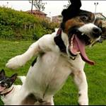
Picky picky picky I know, but all the Roo's legs look funny, and not funny ha ha, but funny peculiar for a Roo in flight. His legs need to be bent and more under the body in balance. ![]()
The stance he/she has looks like he is stalling out.
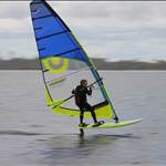
Looking back UP how Mark has super imposed on his sail, (its at an angle I know,) but the Roo looks about right at that angle, and his stance looks OK![]()
They all look good!..... perhaps you should look at getting some sponsorship from Qantas!![]()


just the legs?
Onto the emblem above?
I can do it on paper, no idea how to do it on the computer.
The legs need to be somewhat stylised though I think. You wouldn't want the big claws would you?
And you'll notice the body position of that roo is at quite an angle compared to the other. I'm not sure that leg position will work with the more horizontal body position, and I'm not sure the more angled position will look winswept enough.
Tell me what you want and I'll give it a try
or maybe someone more savvy with a computer can...
there, I (finally) transposed the legs for you.
Is that what you were after?
btw the "hinge point" is called the hock.


Humbly submitted for consideration, based on the good work of several others.

birdman
One like this one (with the roos legs "fixed") gets my vote (or Birdmans above)
so this thread is now "Art class challenge"?
I love where this has gone, maybe i should stir up some other teams.....![]()
![]()
![]()

You can tell there has been no wind for a while. I hated art at school![]()
Toby, I do wonder where you looked to get that photo?! No. I don't want to know.
Toby is clearly better with graphics programs than the rest of us, but I love all this input. See what you've inspired Toby? Even a name change. When we find a combo we are all happy with perhaps Toby could finalise it for us.
I have had the comment that the logos are all a bit staid though, and rather like qantas logos. Perhaps we should think outside the box and try something completely different. Something very stylised.
Hey, they are getting a Pink logo. Ours should also be Pink.
Then instead of turning Pinnas to Pinnaroos, we could have changed it to Pinks. ![]()